I put up a quick post on Reddit the other day that was triggered by some recent frustration with a new Modern Control, in this case the Tab List, and since it seemed to spark some good discussion, I thought I’d share it here as well and maybe expand on it a bit.
I try to use the modern controls where I can but, man, even the ones that are supposedly "GA" have so many issues and limitations it usually just isn't worth it to me right now.
Latest example, I tried to use the Tab List - seems simple enough right? It isn't in Preview, not much to it, what could go wrong?
<vent-rant>
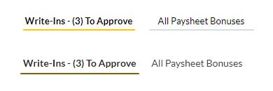
All I wanted to do was change the underline bar color to a specific shade of yellow (my client's brand accent color). Nope can't do that. I changed the "BasePaletteColor", the only option, to the specific RGBA value and instead of that it gives me some seemingly random dirty yellow color (a darkened version of the base). WHY??!?!!! I can specify the font color, why can't I specify this color - the only other object in the control that has color?
</vent-rant>
End result, I deleted the Tab List and recreated it with a couple of buttons and rectangles (since I only needed two tabs) in the same amount of time I spent fiddling around with the Tab List.
I love the modern controls in theory but most of them just have so many limitations it drives me crazy.
Responding to other feedback I added -
All they had to do was tweak the looks of the existing controls or give us more options to tweak them. There was no need to reinvent every single control which in today's agile world means they start barebones and slowly grow from there... smh
Sure, I get they are using a new framework and so are starting from scratch, but IMHO no control should leave Preview status and be considered GA if it has less properties, features, or abilities than the current “Classic” version.
And then…
As if Microsoft was listing, another good example popped up this week with the newly announced Modern icons, where Microsoft thought it was a good idea to remove the OnSelect property for these icons. Really? Stuff like this seriously makes me question who is calling the shots and making these decisions, because they certainly don’t seem to care about what users of the platform want or think.
Some might say, “You should use a button, the new Modern button even has icons built in!”, and to them I would say - please don’t get me started on all the ways the new button is lacking and limited, I’ve ranted enough for today!
Indirectly related to all this, and my specific example above, is the mess that is the new theming in Canvas Power Apps, but that is a topic for another day.
A suggestion or two
I don’t want to be one of those people who complain and don’t offer any solutions or ideas, so here are a couple of simple things that I think would go a long way to helping all Power App developers, citizen and professional.
The Power Apps team should write a blog post outlining their vision and roadmap for the modern controls. Give us some context and reasoning behind these decisions to date that are resulting in a loss of functionality and adjustability (is customizability a word?) compared to the Classic controls and an idea what the end state will be. Help us understand the overall vision and goal, maybe that will ease some confusion and frustrations - I know I would appreciate it.
While I’m suggesting things, you know what another cool thing would be for the Power Apps team to do? Actively engage with the community on some non-Microsoft platforms - on the specific topic of UI and visuals, where is our Miguel Myers that the Power BI community has and loves? Or how about some official interaction on r/PowerApps, again, like r/PowerBI has? And not just the Power CAT team, although they are great, I’d love to see some Product Managers and other decision makers and leaders be more involved, vocal, and transparent.
I am hopeful though
I’ll close by following up on the subtitle to this post, I love Power Apps and work with it every day in my role as a consultant, so any criticism is hopefully constructive and only comes from a desire for the platform to mature and improve. I am also confident things will eventually get to a good state with modern controls and we’ll all think back and cringe at the idea of using classic controls. Unfortunately, that day isn’t here yet in my opinion, as much as I want it to be - but there is always hope.
What do you think? Are you all in on the new modern controls, still only using the classics, or somewhere in between?
Ed


